Our brand
Logo
Last updated: May 30th, 2023
The Edwards logo honours our long established heritage. Our logo is distinctive and has been drawn to reflect our precision engineering. The arc represents our global reach and the pointer, our direction.
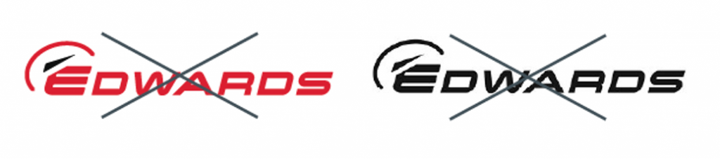
The master logo is made up of Edwards Red and Edwards Dark Grey. It must never be redrawn or altered in any way. The official logo artwork includes a white holding box around the logo, it is an optional element which can be used to make our logo stand out if there is insufficient contrast against the background on which it is placed.
No text or graphic elements should encroach on the logo and the clear space.
Master logo
Clear space
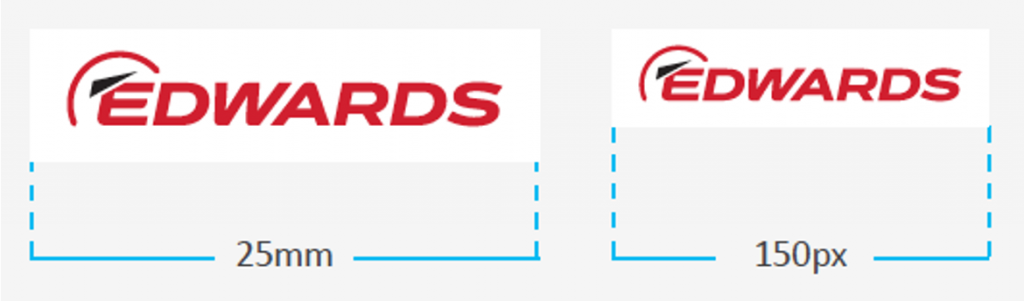
Minimum use size for legibility
Remove or replace our old logo
Please use this opportunity to replace any items that carry our old logo which is four years out of date. Please ask the Brand Team if you need any logo artwork or advice.
The official logo artwork must always be used, which can be downloaded from the Edwards Sharepoint.