Applying our brand
Product branding
Last updated: February 2nd, 2026
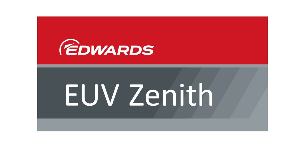
Edwards product labels are designed to ensure a consistent look and feel across all our products. The design is part of our wider brand architecture.
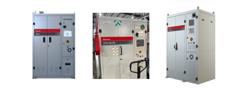
Branding and naming conventions differ across our various business areas, reflecting the specific needs, product structures, and market expectations of each division. To ensure clarity and consistency when working with materials related to the Semiconductor divisions, you will find their dedicated branding approach outlined below.
If you require information on how product labelling is managed within the General Vacuum division, a separate guide is available. This resource provides detailed instructions tailored to that business area, ensuring you can follow the correct standards and apply the appropriate naming conventions depending on the product category you are working with.
Please consult the guide provided here for further details.
Consistency across product lines makes our products easily identifiable, providing quick and simple assurance that every item is built to the high standard expected from a market leader. The labels use an underlying grid system for layout, proportions, typography and logo size.
Most label designs are relatively easy to produce and can sometimes be delivered at short notice by the Edwards Brand Team.
Please contact us to talk through any specific requirements.
The default label uses a width to height ratio of 2 to 1.
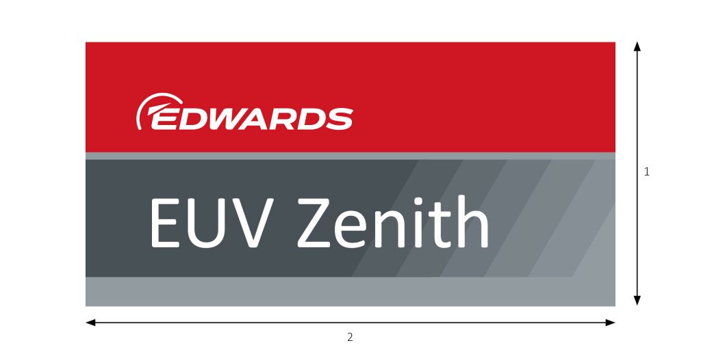
Divisions of the label height define size of the coloured areas.

Typography
Capital letter height for the Edwards logo is 3 vertical units.
The logo is 3 units from base of the red area.
The lower case x-height in the product name is 5 vertical units.
The E of Edwards and the first letter of the product name are 3 horizontal units from the left.
The product name is 4 units from the base of the coloured area.
The product name uses Calibri Regular font. Use optical kerning, set tracking to 20 and then manually adjust letter pairs if needed.
Do not use type ligatures in the product name.
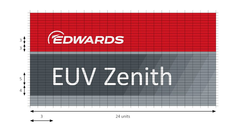
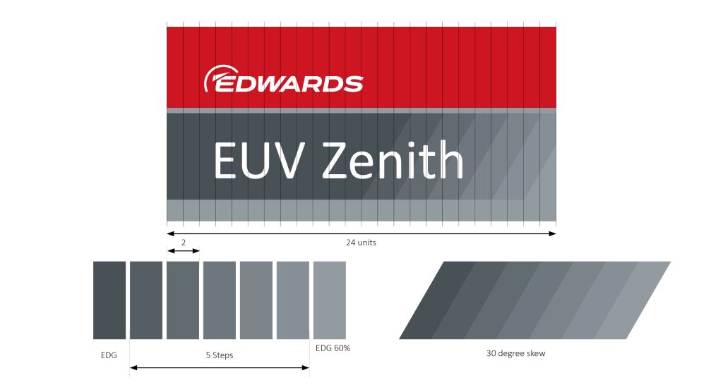
The colour transition is angled at 30 degrees and is two units wide on the 2:1 ratio layout.
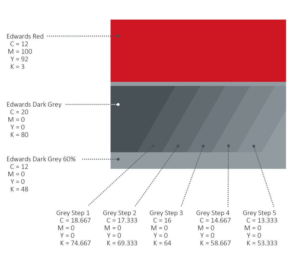
The colours are evenly stepped between Edwards Dark Grey and EDG 60%. The exact colour values are listed below.
Detail showing colour values
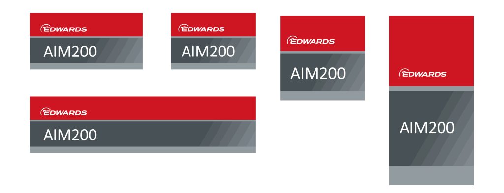
Examples showing other possible layouts.
Please contact the brand team to discuss how the label design can best fit your product.
An example of the product label production process
1. Drawings are received from the product team.
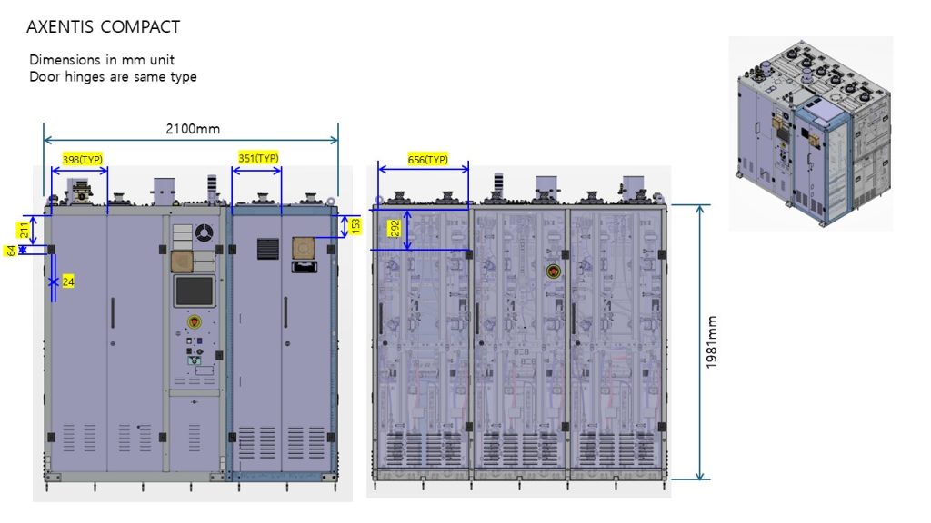
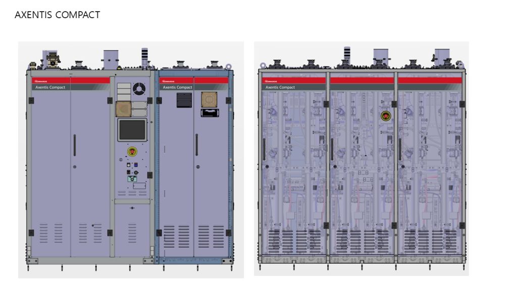
2. First-draft layouts are proposed, showing labels on the machine. Note that in this case the design extends across two or three panels.
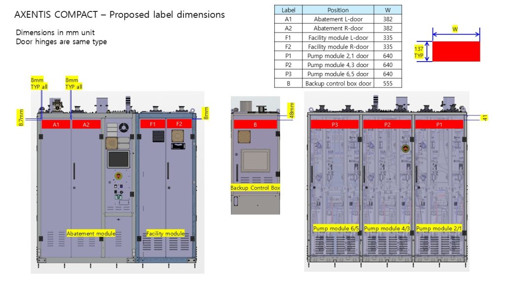
3. Adjustments are needed. In this case slight curvature at the edge of the product panels require a narrower label layout. Sizing can be adjusted to consider practical details like label application.
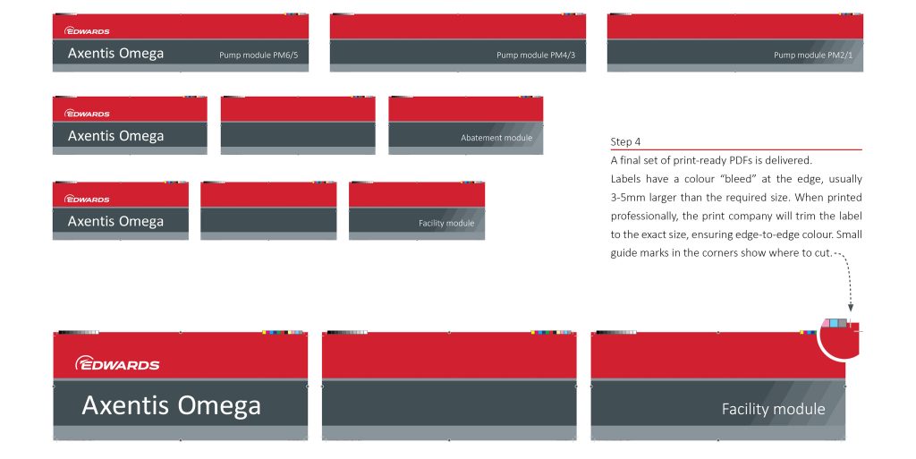
4. The final label layouts. These are provided as print-ready PDFs that should be appropriate for use with most print companies. If a different format is required this can usually be supplied by the brand team.
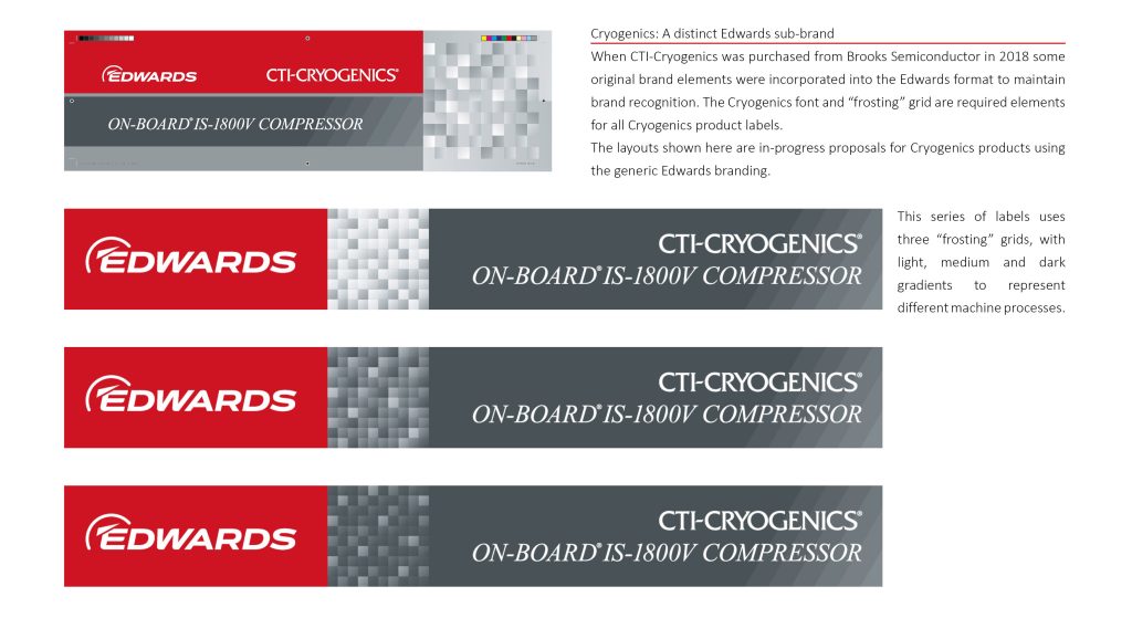
An example of a custom label layout for an establish sub-brand. Cryogenics graphic elements are incorporated into the design to maintain brand recognition.
Mock-ups of the product label on Edwards abatement products.